
NoSkip
The Visual Music Magazine
Concept
NoSkip is a print-first music magazine that treats listening as a physical experience.
NoSkip is a full-length music magazine designed as a functional publication. It combines editorial photography, written features, and an embedded audio system that allows each spread to open into an original track. The goal was to see how a familiar physical format could shift a reader’s perception of new music, and how print design can act as the organizing force for sound, tone, and emotional pacing.
The magazine is built as a complete object: the visual identity, photography, writing, and songs all work together to establish a coherent world. The NFC layer extends the magazine without breaking the reading experience. It treats print as the primary medium and digital tools as supporting material that reinforce attention rather than distract from it.


Components
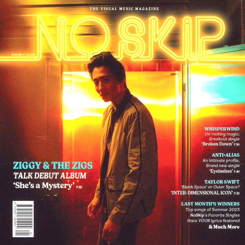
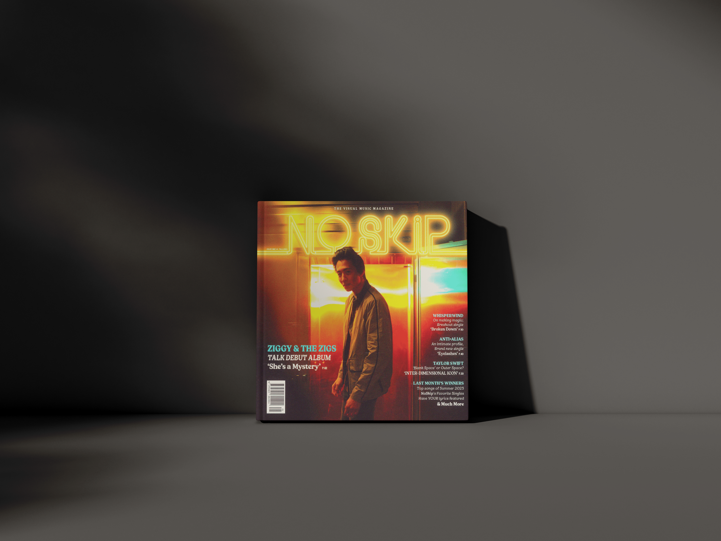
Print magazine (Issue 1)
128-page square magazine (8.5" × 8.5"), perfect bound, full color.
A professionally designed, perfect-bound issue containing:
Feature stories
Artist profiles
Lyric spreads
Editorial photography
A unified typographic and layout protocol
The book is structured to feel like a commercial music publication.
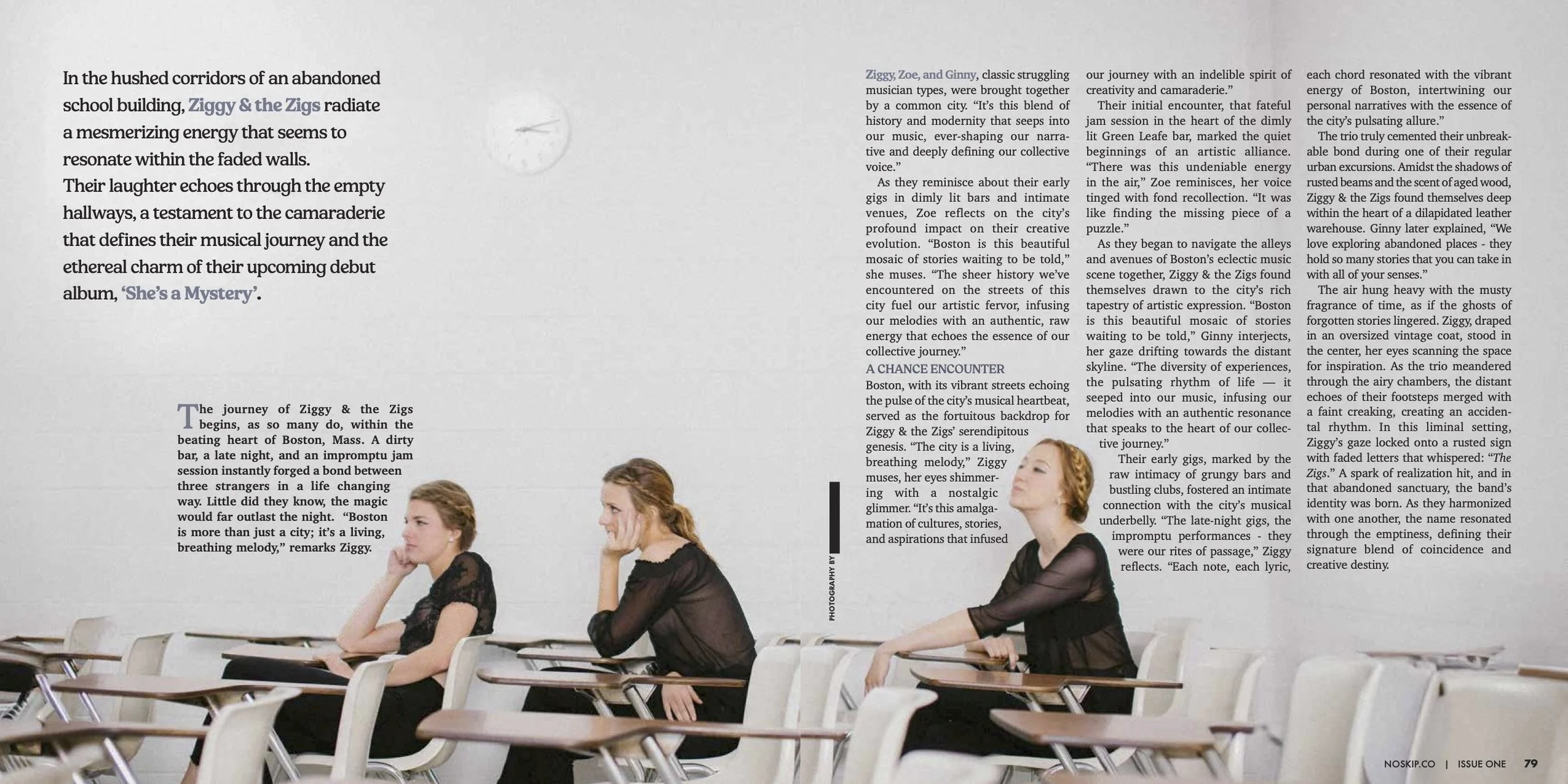
Photography
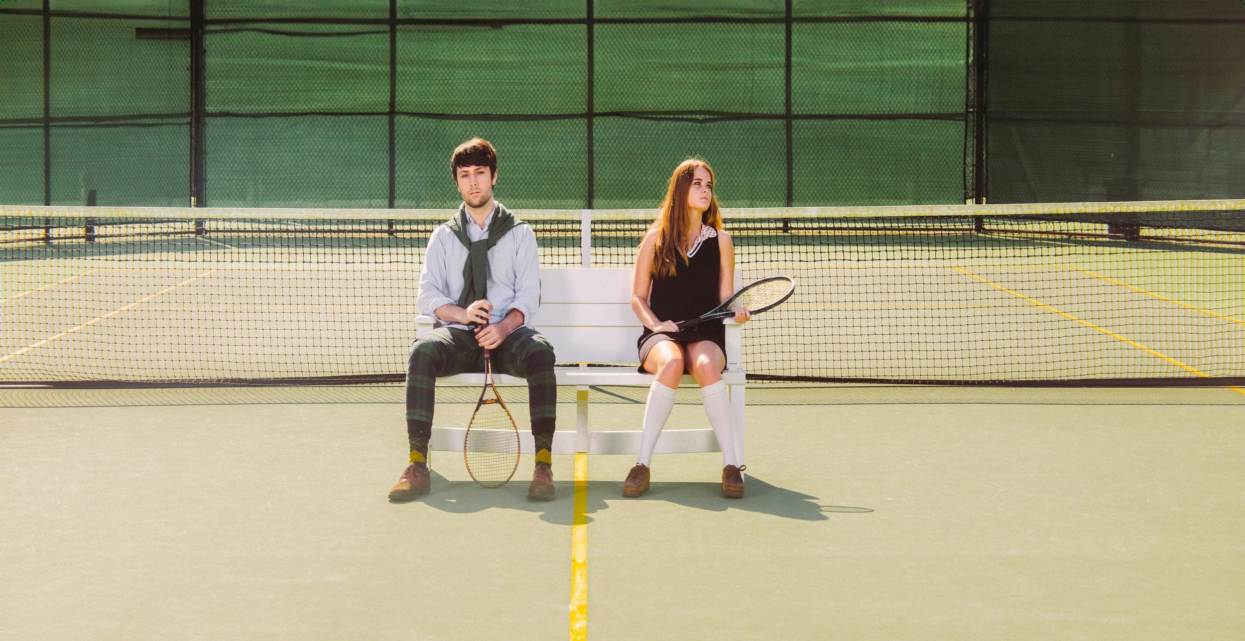
The issue draws from several years of my portrait work.
These images establish tone and guide the rhythm of the magazine; the writing and music respond to the emotional cues set by the photographs. Photography furthermore highlights the importance of human-forward storytelling.
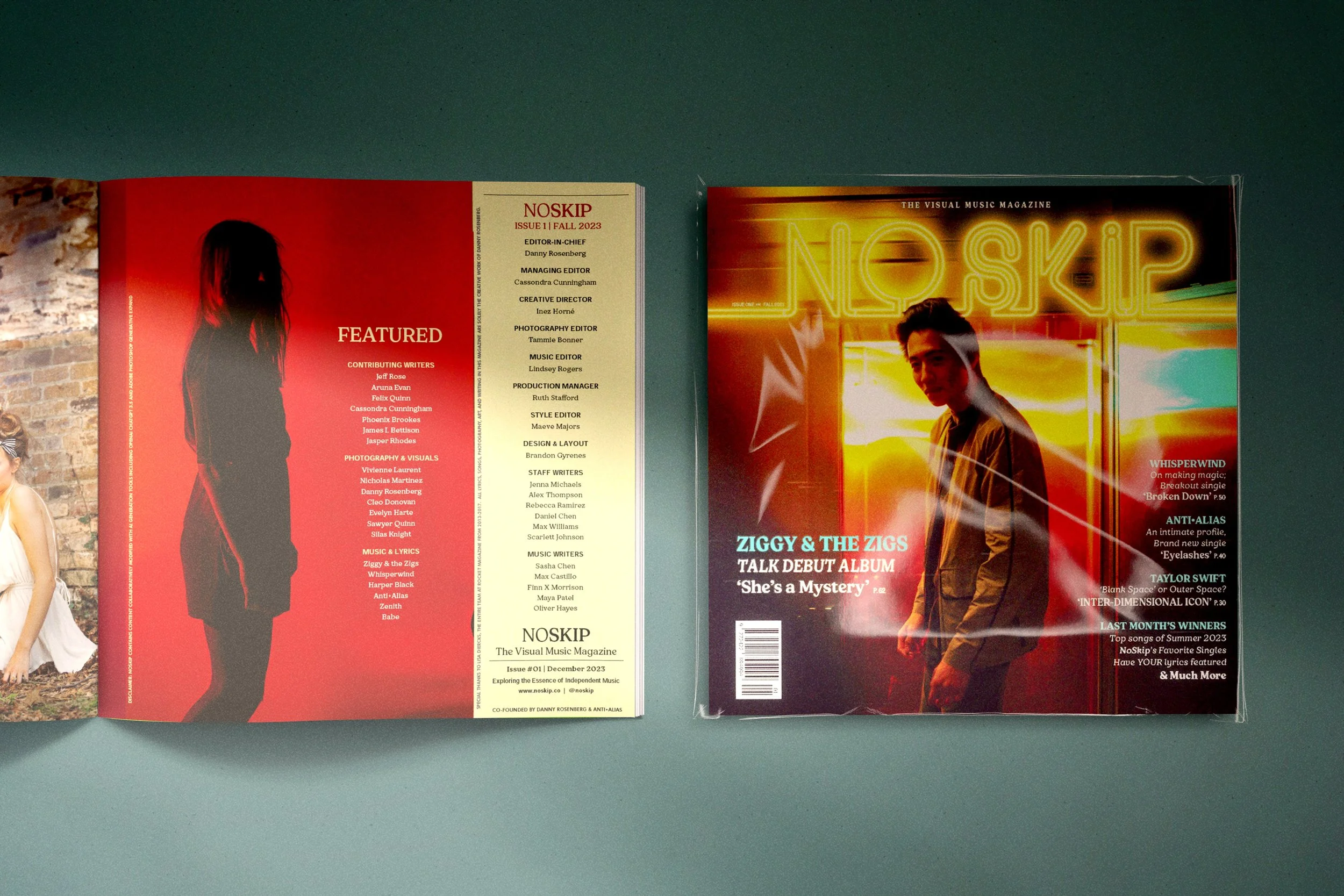
Embedded Audio (NFC)
NFC tags are placed directly on select pages. When tapped, each feature opens directly into a demo track I wrote and produced. The transition from page to audio is quick and quiet; the magazine remains the frame through which the music is understood.
Users tap their phone to the page to access music and other content
Original Music
Every track in the issue is an original composition.
Some pieces began as earlier demos and were rebuilt; others were written specifically for the spreads they accompany. The range of genres reflects the editorial voice of the magazine and my interest in using different musical forms to meet different emotional registers.
Editorial
The writing uses the tone of a real indie magazine: observational, slightly wry, and structured around a fictional music landscape. The content is designed to feel plausible enough that the technology and photography can take the lead.


How It Works
Readers encounter NoSkip like any magazine: starting with images, headlines, layouts, and pacing decisions, all signaling the publication’s values. As they move through the issue, the tactile act of tapping a page introduces audio as a natural extension of the reading experience. The print object sets the tone; the music deepens it.
The structure is intentionally non-linear.
Readers may jump between photography, text, and sound, in any order, guided by the physical logic of the magazine. The material form shapes how they listen, how long they stay with a track, and how they navigate the content.
In Practice
Most readers approach the issue through a visuals lens first. The design encourages hands-on interaction; readers tap pages not because they’re instructed to, but because the magazine makes the gesture feel expected. Once they’ve listened, the user tends to explore additional tracks, moving back and forth between print spread and audio.
The sincerity of the format matters as well. Because the magazine reads as a legitimate cultural object, readers treat the music with more focus than they would online. The material context creates a sense of intention and slows the pace of discovery, which is rare in commercial music experiences today.
The issue has circulated across classrooms, studios, libraries, and music spaces as both a magazine and an experimental media model — a print object that expands into sound without losing its identity as a tangible object.

Significance
NoSkip demonstrates how material form can guide perception.
The project uses design, photography, and sound to test how attention shifts when readers encounter music through a physical object rather than a platform. It is an early exploration of the same ideas that later shaped my installation work: using familiar media to reframe interactive environments, creating small perceptual disruptions, and inviting people to engage before forming judgment.
NoSkip is a study in how physical media can direct attention in a world built for distraction. The magazine treats print as an interface — something that shapes timing, gesture, and expectation. The NFC layer turns the page into a tool rather than a container.
The project also ties together three strands of my practice: design, photography, and music. Instead of existing as separate skills, they operate as one synergistic unit.
The structure is simple, but the world it builds is dense.
The prototype functions as a full model for future issues, each one expanding the musical and visual universe. But even as a single volume, Issue 1 stands on its own as a complete ecosystem.
Credits
Danny Rosenberg: Concept, writing, photography, design, music, production
Tools: Print production, Adobe Creative Suite, Logic Pro, NFC integration, web tools, physical prototyping
Media: 8.5×8.5 full-color magazine, embedded NFC tags, original photography, digital tracklist, supplemental web content
Special Thanks
Lisa Diercks: Advisor / Mentor
Larissa Melo Pienkowski: Review and committee feedback (WLP Graduate Award)
ROCKET Magazine: Legacy photography and model collaboration