More projects
Some projects leave an impact that lingers, shaping creative direction long after their final release. This section highlights past work—projects that are either foundational, experimental, or significant in their own right.
From print magazines to immersive fan projects, these works remain a testament to design, imagination, collaboration, and storytelling.
Though each project is different, they all share a commitment to pushing creative boundaries, playing with form, and making something that feels alive.
Video: Henry Sho Kellam -http://www.mikanmedia.co
ROCKET Magazine
Editor-in-Chief, Creative Director, Photography Chief Editor
(2013–2017)
The defining project of my early career, Rocket Magazine was a student-run print and digital magazine focused on photography, design, and storytelling. As Editor-in-Chief and Creative Director, I led six full-length issues from concept to print, defining the magazine’s signature aesthetic and global presence. My photography was heavily featured in every issue from Fall 2013 to Spring 2017.
Oversaw all creative direction – from photography to layout, typography to branding.
Designed each issue’s visual identity, balancing high-end editorial design with independent art aesthetics.
Led a team of writers, photographers, and designers, managing everything from content curation to press-ready file preparation.

Red (Taylor’s Version)
2022 – Independent Editorial & Design Experiment
Red (Taylor’s Version) (Danny’s Version) seamlessly translates album to book in a way that is both interactive and a distinct piece of art that stands on its own. By distilling Taylor Swift’s award-winning, highly narrative 2021 re-recording of Red into book form, listeners and readers alike are challenged to interact with the music in a sensorily novel way.
Meticulously designed typography at a letter-by-letter scale to capture the raw emotion and musicality of the lyrics.
Integrated NFC technology into the cover and interior pages, allowing readers to tap their phone to access music, videos, and more.
Featured in-depth song background and analysis, bridging literary storytelling with musical experience.
Designed to be consumed in tandem with the album, Red (Taylor’s Version) (Danny’s Version) proves that a highly celebrated album can take on an entirely new life in print.
(Danny’s Version)
All the Young DUdes
2022–Present – Book Design & Print Experimentation
An independent book design project reimagining the cult-favorite fan novel All the Young Dudes, this edition explores how a digital-first work can be transformed into a collectible, thoughtfully designed book.
Balanced classic novel aesthetics with a playful YA-inspired cover, designed for display and collection.
Selected time-appropriate typefaces, embracing the era and setting of the novel.
Part of an envisioned series, with future editions expanding the design’s evolution.
This project highlights how fan-driven storytelling can be elevated through thoughtful print design.
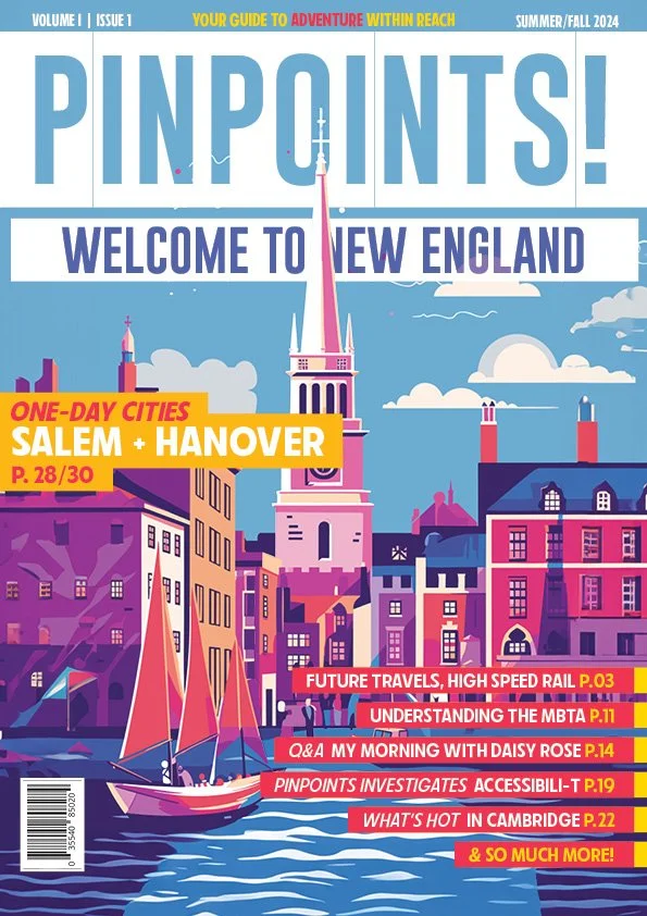
Pinpoints! Magazine
2024 – Print & Digital Editorial Design
A functional, printed mockup of a regional travel magazine, Pinpoints! was designed to be playful, visually striking, and highly readable.
Bright, bold design aesthetics with vibrant colors and immersive illustrations.
Highly structured layouts, incorporating banners, section colors, and typography hierarchy for readability.
A4 trim size with high-gloss paper, balancing premium feel with durability.
Pinpoints! was a study in how design influences reader engagement, especially in free, commuter-friendly print media.


